Natural
Real ingredients, shown as they are. Leaves, whole spices and earthy colour instead of loud graphics.
Case study · Brand identity
Nirai means fullness, and abundance.
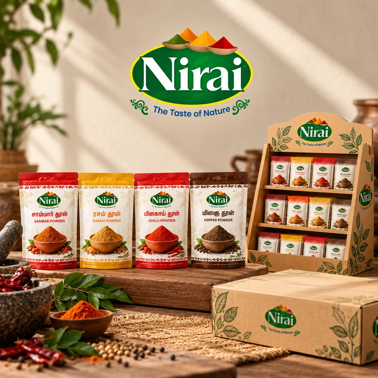
Nirai makes everyday spice powders, the sambar, rasam, chilli and pepper that go into almost every Tamil kitchen. The product was honest and good. The brand needed to say so, at a glance, on a crowded shelf.
The name gave us our starting point. In Tamil, Nirai means fullness, something complete and abundant. We set out to build a brand that feels exactly that: full of flavour, full of nature, and fully trustworthy.
Before drawing a single line we agreed on what Nirai should stand for. Three words became the filter for every decision that followed.
Real ingredients, shown as they are. Leaves, whole spices and earthy colour instead of loud graphics.
Rooted in Tamil food culture. Bilingual labels, so the Tamil name comes first and nobody has to guess.
A confident seal-like mark and a consistent system, so every pack looks like it came from the same careful hands.
We walked the spice aisle of local supermarkets and kirana stores and mapped every brand we found by two questions: does it feel traditional or modern, and everyday or premium?
Six steps from a conversation to a finished shelf. Each one builds on the last.
Conversations with the founders, a tour of production, tasting every blend.
Store walks, competitor mapping and a list of what shoppers actually look for.
The “fullness of nature” idea and three values: natural, authentic, trusted.
Pencil-first logo exploration in the sketchbook, fast and loose.
Nine digital directions, tested at pack size and from across the aisle.
Pouches, display unit, shipper carton and imagery, all from one system.
Chapter one
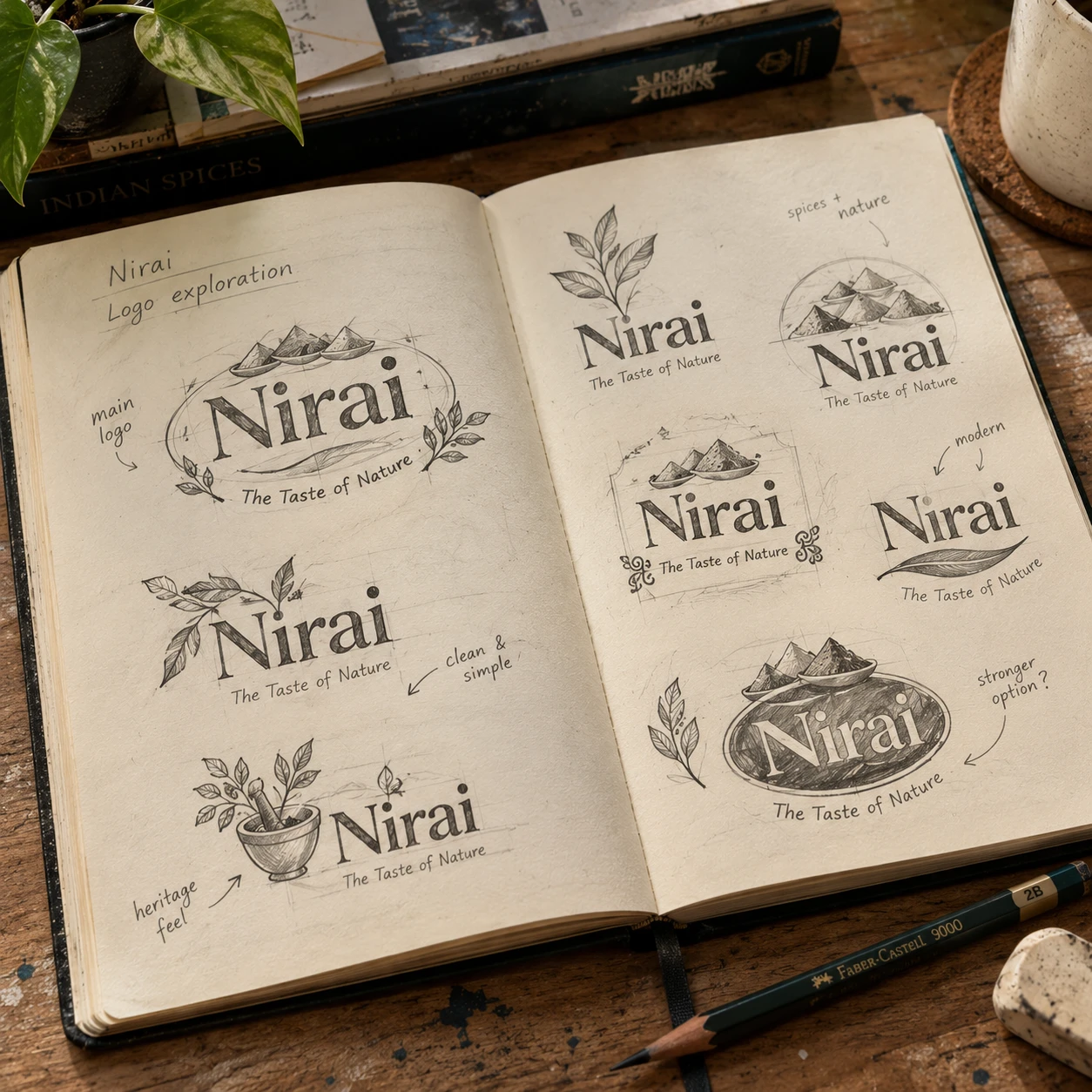
Every Nirai mark began on paper. Sketching by hand lets ideas move faster than software and keeps the warmth that a food brand needs.
We explored four directions on these pages: a main seal with spice bowls, a clean and simple leaf mark, a heritage mortar and pestle, and a modern wordmark with a sweeping leaf. The notes in the margins are the real conversation we had with the page.
Chapter two
The strongest sketches became nine digital explorations. We printed each one at pouch size and judged it from two metres away, the way a shopper actually sees it.
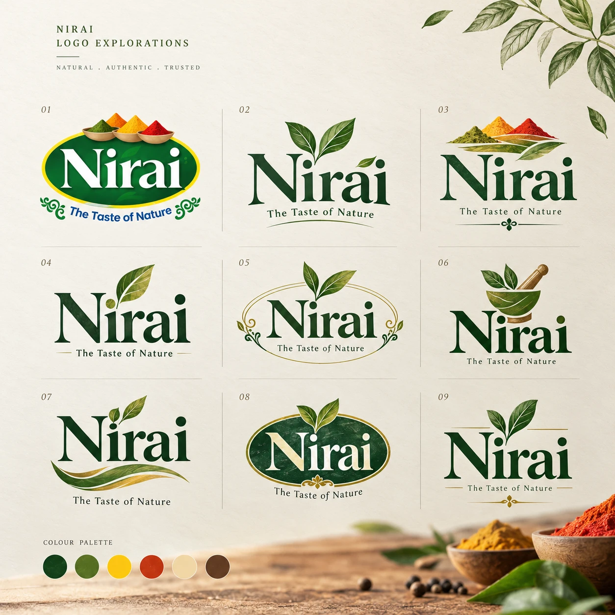
Reads instantly. Three bowls of spice tell you what’s inside before you read a word.
Owns the shelf. The deep green oval breaks the wall of red and yellow around it.
Works as a seal. It sits naturally on pouches, boxes and display units, like a mark of quality.
Every colour comes from an ingredient: curry leaf, turmeric, dried chilli, pepper and the cream of a cloth sack.
#1E4D2B#5C7F2A#F2C21B#C8371D#F3EAD3#5B3A21Chapter three · Special mention
Illustration is where a brand gets its soul. Ours is drawn by hand, digitally, stroke by stroke, never pulled from a stock library.
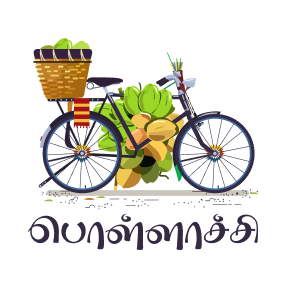
Anyone who has driven through Pollachi knows this sight: a bicycle at the roadside, piled high with tender coconuts, a woven basket balanced on the back. It’s the town’s most familiar welcome.
We drew it by hand on a digital canvas, building up each coconut, each spoke and each strand of the basket. The Pollachi lettering is hand-drawn too, so the type and the picture feel like one piece.
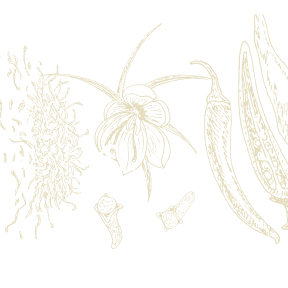
The same hand drew a set of fine botanical spice drawings. Printed in a soft gold on cream, they frame every pouch with a quiet, crafted texture that stays out of the way of the product name.
Chapter four
One system, applied everywhere. Hover the dots to see how each piece works.
Chapter five
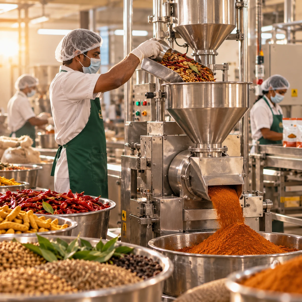
Shoppers trust what they can see. We created brand imagery of the grinding and packing process, from whole chillies and turmeric to fresh powder, with the team in Nirai green aprons.
These visuals carry the story onto the website, social media and trade presentations, so the “taste of nature” promise is backed by something real.
Everything Nirai needs to show up consistently, from the factory floor to the shop counter.
Brand idea, values and tone of voice
Shelf study and positioning map
Primary seal, wordmark and tagline lock-up
Ingredient-led palette and bilingual type
Sambar, Rasam, Chilli and Pepper powder pouches
Kraft counter display unit
Branded outer box with leaf artwork
Hand-made botanical line art set
Process visuals for web and social
Rules for using it all, consistently
Come, let’s talk.